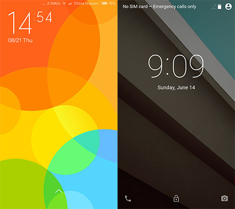
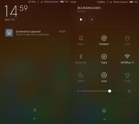
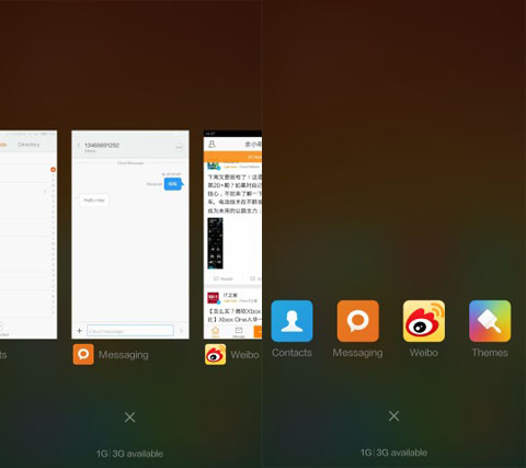
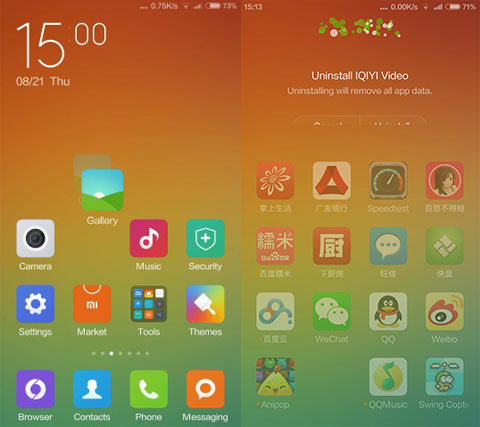
One of the most awaited announcements from Google is its new version of OS — now known only by the name Android L. We’ve reported before that it promises a significant boost in performance and even in battery life, but one of the most noticeable change is its layout. Here is a comparison from a thread at MIUI’s site of the awaited Android L against the new MIUI 6 that was just announced last week.

MIUI’s Lock Screen allows you to swipe up or left to launch Camera app. Android L adds sideways swipe that gives access to your dial pad.

MIUI 6 shows the number of notifications inside a circle. Android L, on the other hand, lets you reply directly to notifications with its “Smart Lock Screen”.

MIUI offers an entire frosted background to make the icons pop out more. Stock Android L limits the icons inside a window.

The notification bar of the MIUI 6 can accessed by swiping down anywhere on the screen. Users may swipe left and right to go to notification toggle.

Still on a frosted background, MIUI’s Recent Apps can be viewed as apps or cards. Swipes up to close.

Icons for MIUI are uniquely animated – tiles have shadows when you move them, they shake like in iOS, and have “firework” effects when you delete them.
From what we can see, MIUI 6’s interface is going after an iOS look. Partner that with the Mi 4’s display and we’re looking at colorful tiles on a Full HD resolution. Android L, however, still keeps its classic appeal but definitely with some tweaks. Both look very easy to navigate around with and are aesthetically pleasing in their own ways.
But if you were to choose, which user interface would better suit you?
{Source}

YugaTech.com is the largest and longest-running technology site in the Philippines. Originally established in October 2002, the site was transformed into a full-fledged technology platform in 2005.
How to transfer, withdraw money from PayPal to GCash
Prices of Starlink satellite in the Philippines
Install Google GBox to Huawei smartphones
Pag-IBIG MP2 online application
How to check PhilHealth contributions online
How to find your SIM card serial number
Globe, PLDT, Converge, Sky: Unli fiber internet plans compared
10 biggest games in the Google Play Store
LTO periodic medical exam for 10-year licenses
Netflix codes to unlock hidden TV shows, movies
Apple, Asus, Cherry Mobile, Huawei, LG, Nokia, Oppo, Samsung, Sony, Vivo, Xiaomi, Lenovo, Infinix Mobile, Pocophone, Honor, iPhone, OnePlus, Tecno, Realme, HTC, Gionee, Kata, IQ00, Redmi, Razer, CloudFone, Motorola, Panasonic, TCL, Wiko
Best Android smartphones between PHP 20,000 - 25,000
Smartphones under PHP 10,000 in the Philippines
Smartphones under PHP 12K Philippines
Best smartphones for kids under PHP 7,000
Smartphones under PHP 15,000 in the Philippines
Best Android smartphones between PHP 15,000 - 20,000
Smartphones under PHP 20,000 in the Philippines
Most affordable 5G phones in the Philippines under PHP 20K
5G smartphones in the Philippines under PHP 16K
Smartphone pricelist Philippines 2024
Smartphone pricelist Philippines 2023
Smartphone pricelist Philippines 2022
Smartphone pricelist Philippines 2021
Smartphone pricelist Philippines 2020
Christian says:
I’m not digging Android L’s interface. It seems to use more power and memory. I’m wondering how they could achieve Peoject Volta with it. With Android L’s launch, I am not as thrilled as the time when my Nexus 7 transformed from JB to KitKat.
EveryoneIsACopycats says:
but then, when did miui ui copied from? it’s pretty obvious from iOS.. I know since I own both device :))
though what I hate about android is those clutter ui to start with(and samsung for overdoing it), It’s pretty cool they’re doing the minimalistic style this time :P
Read my name and deal with it, originality is a thing from the past :))
EveryoneIsACopycats says:
I’m not talking about the icon design only(not ios 7 alone), I’m talking about the ui in general. mi3 got only home pages same as ios(instead of using the android stock ui, they actually change the whole ui and make it look inspired with ios ui), the setting’s arrangement is also looks the same and any other element. The very first impression after using my mi3 for the first time? it really looks familiar.
http://mashable.com/2014/08/19/miui-6-ios-7-compared/
and check the very first miui 1 up to the latest.
archie says:
Wrong. Meizu’s Fly UI was first to use that almost flat icon interface years before Android Jelly Bean and iOS adapted the minimalist look. Some designs are meant to be copied unintentionally but iOS is blatant to patent their works as ‘original ideas’.
Justin says:
All this just to compare UIs?
Wow, dude. You either need to look for something more substantial to write about… or get a life.
kuratong says:
How about you go home and hang yourself justin
archie says:
Why are you demanding things from the writer when they’re not demanding anything from you? Tech blog ito natural na may comparisons na mangyayari. Just fuck off or ignore it if you don’t like the article.
francis says:
no second thought, miui has the best customizable os in smartphone world… so many awesome themes to choose from, and hindi lang theme yung napapalitan, almost everything changes like dialer, messenger, lockscreen, settings, icons etc.
archie says:
Have you tried using MIUI launcher? Stable ba ang interface? Susubukan ko kasing gamitin yung MIUI6 sa Sony Z1 ko and I just need first hand users’ comments. Thanks.
Di nga says:
Tech Site kasi to.. kahit engadget, gsmarena, anandtech, tomshardware eh nagrereview/nagcocompare ng interfaces.
magcomment ng may sense hindi un makapagcomment lang. gamitin din kasi ang utak paminsan minsan
Boybezeltanga says:
Nakakapaginternet ka ni simpleng google search di mo magawa?
at konting lawak ng utak naman, may sinabi akong Android L at MIUI LANG ? gumamit ka din ng reading comprehension pero unahin mo muna pagkuha ng utak sa palengke
boy bezel says:
bigyan mo ako ng link sa mga binanggit mo na site na nagcocompare ng miui 6 sa android l.
Emily says:
Yung recent apps ng MIUI also copied the recent apps by Windows Phone by Microsoft?
TessPinga2 says:
Agree. What’s the point of this article?
biya says:
binigyan lang yan ng internet feeling na matalino sya eh. kaya walang asenso ang Pinas dahil sa mga taong makagraduate lang ng HS at nakahawak ng PC at nakakapaginternet eh feeling magaling na
archie says:
Maybe the article was about comparing MIUI versus Android L to show their ups and downs? What the fuck with people asking stupid questions on obvious answers? Ganun na ba talaga kababa ang literacy rate sa Pinas? No wonder nananalo ang tulad ni Noynoy sa bansa natin.
Komento says:
O tapos?