If you look at smartphones today and then look back to a few years ago, you will quickly realize how much has really changed in so many aspects. The most upfront comparison between then and now, since it is observed visually, is design. But today, we’d like to focus on a particular part of smartphone design — the screen.
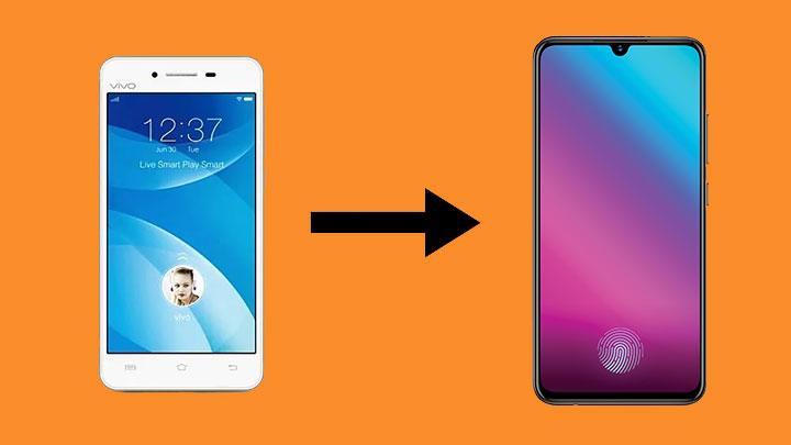
Now, the screen component itself is another category on its own due to the vast developments in display technology. However, there is no doubt it plays into the design of a smartphone as a whole; it’s the first thing you see in a modern handset. This is evident in pretty much any smartphone brand, but for this article, we’re gonna be illustrating it with the VIVO V-series.
To show the evolution, we’re gonna be taking a look at screen size, screen-to-body ratio, and since VIVO is now a brand known for its affinity to selfies, front camera resolution.
Table of Contents
VIVO had just started their international expansion a year prior to the release of the first V-series phones, the V1 and V1 Max in 2015.
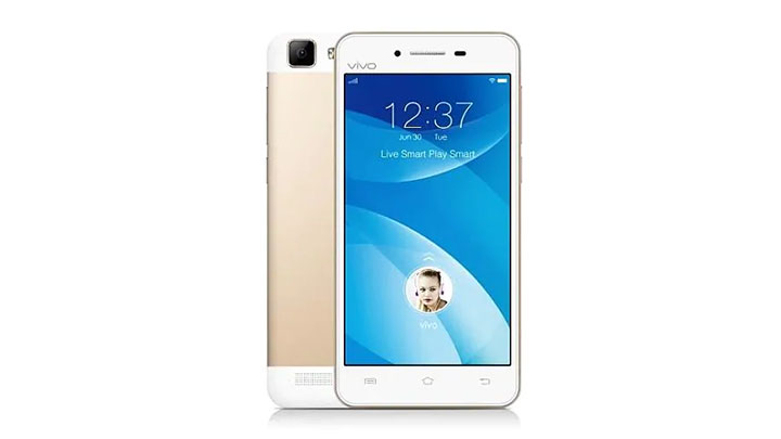
| VIVO V1 | VIVO V1 Max | |
|---|---|---|
| Screen size | 5.0-inches, 1280 x 720 pixels | 5.5-inches, 1920 x 1080 pixels |
| Panel type | IPS | IPS |
| Screen-to-body ratio | 67.58% | 70.16% |
| Front camera resolution | 5MP | 5MP |
The VIVO V1 and V1 Max had a look that was considered pretty basic. It had a thick side, top, and bottom bezels. The V1 had a 5-inch screen, while the V1 Max had a 5.5-inch screen which was getting more and more popular at the time. Also, at this point, VIVO was not focusing so much on selfie-centric-ness, so to speak, hence the basic 5MP front camera.
In 2016, the second generation of the V-series was released in the form of the V3 and V3 Max.
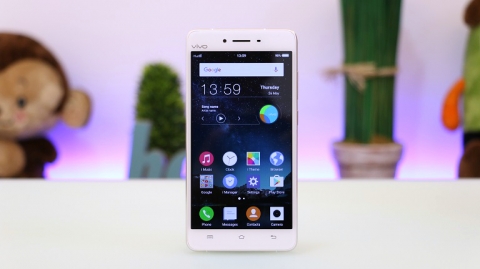
| VIVO V3 | VIVO V3 Max | |
|---|---|---|
| Screen size | 5.0-inches, 1280 x 720 pixels | 5.5-inches, 1920 x 1080 pixels |
| Panel type | IPS | IPS |
| Screen-to-body ratio | 67.44% | 70.12% |
| Front camera resolution | 8MP | 8MP |
In a year’s time, close to nothing had changed. We still got the same basic look, same screen sizes, and pretty much the same screen-to-body ratios. This time though, the front camera resolution was bumped up to 8MP.
In late 2016 through early 2017, the third generation of the V-series came with not two, but three SKUs this time. We got the V5, V5 Plus, and V5s.
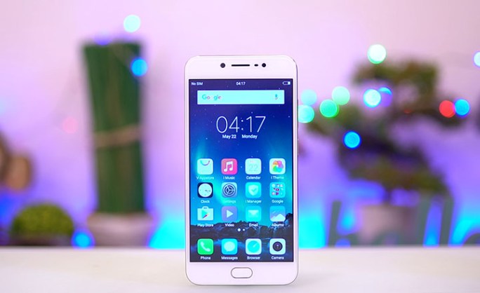
| VIVO V5 | VIVO V5 Plus | VIVO V5s | |
|---|---|---|---|
| Screen size | 5.5-inches, 1280 x 720 pixels | 5.5-inches 1920 x 1080 pixels | 5.5-inches, 1280 x 720 pixels |
| Panel type | IPS | IPS | IPS |
| Screen-to-body ratio | 71.8% | 73.8% | 71.8% |
| Front camera resolution | 20MP | 20MP + 8MP | 20MP |
With the V5 series, we had some signs of life in terms of improvement. The 5-inch screen option was gone, solidifying 5.5-inches as a new standard. The screen-to-body ratio didn’t increase by much, but the look of the front of the phones was fresher; we got thinner side bezels. Most notably, the front camera resolution had been bumped up more than two-fold compared to the previous generation, to 20MP. The V5 Plus even had a dual front camera setup, a trend which has been gaining steam ever since.
In late 2017, VIVO came out with the V7 and V7+, the successors to the V5 series.
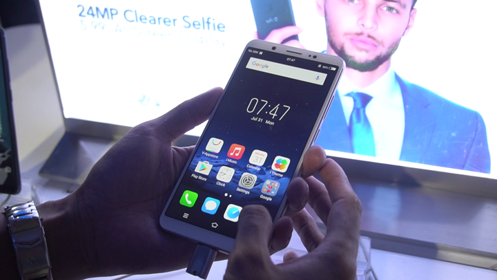
| VIVO V7 | VIVO V7+ | |
|---|---|---|
| Screen size | 5.7-inches, 1440 x 720 pixels | 5.99-inches, 1440 x 720 pixels |
| Panel type | IPS | IPS |
| Screen-to-body ratio | 77.1% | 78.4% |
| Front camera resolution | 24MP | 24MP |
This wasn’t a huge turning point in the series, but the release of the V7 phones marked an even bigger change compared to the previous generation’s change. The base screen size, seen in the V7, was bumped up to 5.7-inches. The V7+, though, had a huge 5.99-inch screen. At this point, the trend in aspect ratio had changed. 16:9 was out of fashion, and 18:9 was all the rage. The downside though, was that neither the V7 or V7+ had a 1080p screen.
Screen-to-body ratio was also a lot better, being closer to 80%. This is evident in the minimal bezels. Front camera resolution was bumped up yet again to 24MP, though this time the dual front camera was absent.
While VIVO was busy launching the V7 and V7+, Apple was busy with the release of one of their new devices at the time, the iPhone X. It was the first phone to popularize the infamous ‘notch’, which is a cut-out on the top of the screen. A lot of brands, including VIVO, followed suit. The VIVO V9 was released earlier this year.
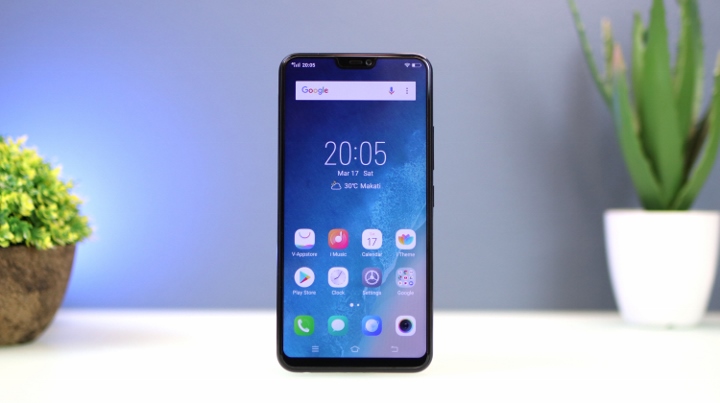
| VIVO V9 | |
|---|---|
| Screen size | 6.3-inches, 2280 x 1080 pixels |
| Panel type | IPS |
| Screen-to-body ratio | 85.2% |
| Front camera resolution | 24MP |
With a bit of extra space at the top of the screen, the V9 had its vertical resolution bumped up to 2280 pixels. The addition of the notch also brought the screen-to-body ratio closer to 90%. The front camera resolution stayed at 24MP.
The rectangular notch design has been somewhat getting stale over the last year, with true “all-screen” phones becoming the ideal. VIVO recently responded to this in the mid-range segment by releasing the V11 and V11i in September of this year.
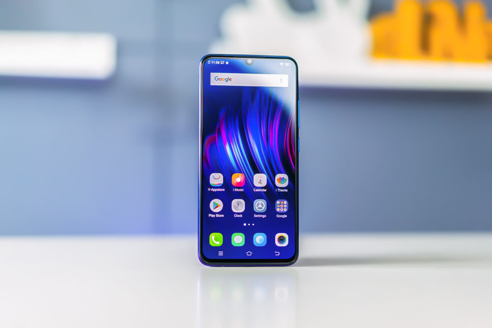
| VIVO V11 | VIVO V11i | |
|---|---|---|
| Screen size | 6.41-inches, 2340 x 1080 pixels | 6.3-inches, 2280 x 1080 pixels |
| Panel type | Super AMOLED | LTPS IPS |
| Screen-to-body ratio | 85.2% | 84% |
| Front camera resolution | 25MP | 25MP |
The V11 and V11i’s notches only house the front camera, leaving more space at the top of the screen. This is also the first time the 6-inch screen size barrier had been broken in the V-series. Screen-to-body ratio has progressively been getting higher, allowing screens to be bigger without significantly increasing the overall dimensions of a phone. Another first is the use of a Super AMOLED display, which the V11 has. The front camera resolution is also now at its highest in the history of the V-series, at 25MP.
Looking at how the screen and front camera of the VIVO V-series have evolved, there’s a clear picture of what the future holds for the brand. “All-screen” phones are in, so perhaps the VIVO NEX S’s technology will trickle down? Also, there has been a steady increase in front camera resolution, so we can probably expect something higher than 25MP next year when the V13, or whatever it will be called, is released.

YugaTech.com is the largest and longest-running technology site in the Philippines. Originally established in October 2002, the site was transformed into a full-fledged technology platform in 2005.
How to transfer, withdraw money from PayPal to GCash
Prices of Starlink satellite in the Philippines
Install Google GBox to Huawei smartphones
Pag-IBIG MP2 online application
How to check PhilHealth contributions online
How to find your SIM card serial number
Globe, PLDT, Converge, Sky: Unli fiber internet plans compared
10 biggest games in the Google Play Store
LTO periodic medical exam for 10-year licenses
Netflix codes to unlock hidden TV shows, movies
Apple, Asus, Cherry Mobile, Huawei, LG, Nokia, Oppo, Samsung, Sony, Vivo, Xiaomi, Lenovo, Infinix Mobile, Pocophone, Honor, iPhone, OnePlus, Tecno, Realme, HTC, Gionee, Kata, IQ00, Redmi, Razer, CloudFone, Motorola, Panasonic, TCL, Wiko
Best Android smartphones between PHP 20,000 - 25,000
Smartphones under PHP 10,000 in the Philippines
Smartphones under PHP 12K Philippines
Best smartphones for kids under PHP 7,000
Smartphones under PHP 15,000 in the Philippines
Best Android smartphones between PHP 15,000 - 20,000
Smartphones under PHP 20,000 in the Philippines
Most affordable 5G phones in the Philippines under PHP 20K
5G smartphones in the Philippines under PHP 16K
Smartphone pricelist Philippines 2024
Smartphone pricelist Philippines 2023
Smartphone pricelist Philippines 2022
Smartphone pricelist Philippines 2021
Smartphone pricelist Philippines 2020
magic says:
evolution? smartphones are getting dumber and dumber. some already lost the 3.5mm jack and that is so stupid.
the notch is one of the worst things to happen to smartphones. this is not evolution. it became worse.
JustSayin says:
So technically the definition of “evolution” in your dictionary is all about the physical change of the phone. You completely disregard all the things that is much more valuable than that. Ram, ppi, camera mp, battery and even resolutions. Jeez brother its not all about phisical appearance.
jobert_sucaldito says:
This looks like a paid ad by vivo. unbox,ph also has the same, praising vivo and their ‘technological advancements’ duh.
Kabitenyo says:
What’s more to design if you only got the screen left? lazy designers.