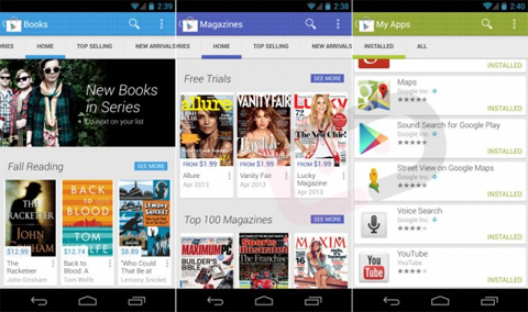
Folks over at Droid-Life has gotten an alleged version of the Google Play Store, version 4.0, which brings a major UI overhaul.
Gone is the boxy-UI from the old version, and here comes all the bright colors and a massive dedication for Android’s Holo UI. Overall, it looks lighter and cleaner with similar feels to other Google apps like Google Now, YouTube and even things all the way down to Android’s messaging app.

The new Play interface fits perfectly with the other services of the company, so it seems very logical for the update to arrive. If you’re asking about the release of this update, well, it could silently slip into your phone unnoticed like the Google Settings app – or it could come this Google I/O – which is speculated to release a ton of things like Babble (a rumored messaging app that aims to unify Talk, Hangouts, Voice and the rest), the much-awaited Motorola X phone, and probably a new version of Android to release with a few Nexus devices.
Google’s been pretty active lately, since just recently they released their new service, Google Keep, they retired Google Reader, and who knows what’s next?
{via}

YugaTech.com is the largest and longest-running technology site in the Philippines. Originally established in October 2002, the site was transformed into a full-fledged technology platform in 2005.
How to transfer, withdraw money from PayPal to GCash
Prices of Starlink satellite in the Philippines
Install Google GBox to Huawei smartphones
Pag-IBIG MP2 online application
How to check PhilHealth contributions online
How to find your SIM card serial number
Globe, PLDT, Converge, Sky: Unli fiber internet plans compared
10 biggest games in the Google Play Store
LTO periodic medical exam for 10-year licenses
Netflix codes to unlock hidden TV shows, movies
Apple, Asus, Cherry Mobile, Huawei, LG, Nokia, Oppo, Samsung, Sony, Vivo, Xiaomi, Lenovo, Infinix Mobile, Pocophone, Honor, iPhone, OnePlus, Tecno, Realme, HTC, Gionee, Kata, IQ00, Redmi, Razer, CloudFone, Motorola, Panasonic, TCL, Wiko
Best Android smartphones between PHP 20,000 - 25,000
Smartphones under PHP 10,000 in the Philippines
Smartphones under PHP 12K Philippines
Best smartphones for kids under PHP 7,000
Smartphones under PHP 15,000 in the Philippines
Best Android smartphones between PHP 15,000 - 20,000
Smartphones under PHP 20,000 in the Philippines
Most affordable 5G phones in the Philippines under PHP 20K
5G smartphones in the Philippines under PHP 16K
Smartphone pricelist Philippines 2024
Smartphone pricelist Philippines 2023
Smartphone pricelist Philippines 2022
Smartphone pricelist Philippines 2021
Smartphone pricelist Philippines 2020
nhel says:
great … so cool!!!
Justin says:
Three-da-do… to four-da-do…. parang abnoy magsalita….
tarush says:
Yes, they badly need to redesign their store, just compare it to Apple’s AppStore and you will probably know why.
Yes Gaming says:
I’ve heard about this news and I’m looking forward for a better design for the Google Play.
havhhvas says:
sana hindi lang interface redesign. ayusin na ren yung stuck download bug.
PhSMASH says:
i think the main problem about the Playstore is that they don’t filter infected malware apps :(