The majority of us have never experienced life without the internet. Web browsers have been a thing ever since, and like most things in life, they’ve undergone extensive changes from the time they made their debuts. Included in those updates is a web browser’s logo; some of them have had minimal changes, but some have transformed greatly. Check out how web browsers’ icons first looked like versus their current design.
Table of Contents
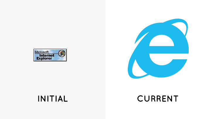
Microsoft launched Internet Explorer in the year 1995. It came with Microsoft’s Windows 95 operating system. The browser’s initial logo was square-shaped, with the words “Microsoft Internet Explorer” on one side and the Windows logo next to it, and a blue sky background to finish it off. In Internet Explorer’s latest logo, though, almost every element of its primary logo is nowhere to be found. The current logo consists of the browser’s iconic e with an orbit, done in a flat style. This would be the browser’s final logo, as Microsoft discontinued the Internet Explorer in 2015, to give way for a new, modern browser.
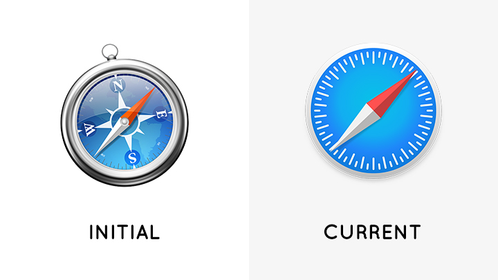
Developed by Apple, Safari had its initial release in 2003 through the MacOS Panther desktop and operating system. Since then, the browser has become the default for Apple devices. Safari’s old logo was that of a fully-illustrated compass. Fast-forward to now, Safari’s logo ditched the detailed style for a more simple one. It’s still a compass but without all the extra design elements.
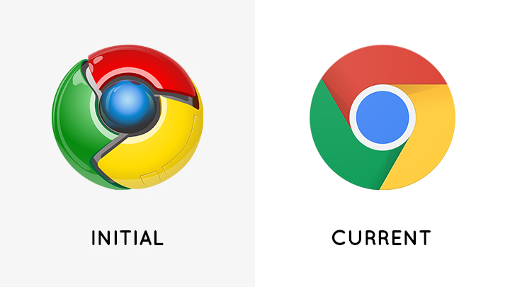
Google developed and released its browser, Chrome, in 2008. First launched on Windows systems, Chrome’s initial logo was a 3D orb that incorporated the brand’s primary color palette. After slowly transitioning from 3D to 2D, Google decided to flatten its symbol further, giving it a simple, minimal look.

Some browsers not only change their logos but their names as well. Mozilla initially launched its browser under the name Phoenix, before changing it to Firebird. After being pressured by the Firebird database project to change the browser’s name, Mozilla then gave in and renamed it to Firefox in 2004. As the browser was first released under the codename Phoenix, it’s icon was that of the mythical bird that seemingly rose from the flames. Years later, after name and logo changes, Firefox’s current one displays that of a fox embracing an orb, with its head turned towards the user. The symbol follows the stylized yet flat icon trend in today’s time.
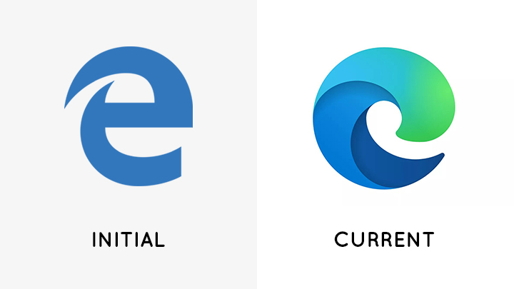
In 2015, Microsoft introduced Edge as the replacement for the discontinued Internet Explorer. Edge’s original icon resembled that of its predecessor’s, showcasing a flat e, just without the orbit. Recently, Microsoft introduced Edge’s new logo, shaking off all references to the Internet Explorer. Instead, the logo now looks more modern and looks similar to a wave. Upon a close look, the icon also bears the letter e.
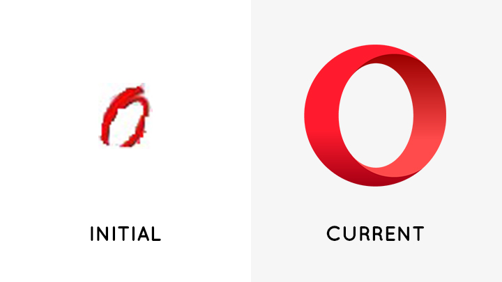
Opera saw its beginnings in 1994 under Telenor, a Norwegian telecommunications company. The browser’s primary logo consisted of an italicized O with its opening and ending tails not meeting each other. After branching out from Telenor into its own separate company, Opera has then undergone extensive changes, including its logo. Its current logo preserves the brand’s familiar red O but now in a 3D ring shape and makes use of negative space.
Which web browser logo redesign is your favorite? Let us know in the comments!

YugaTech.com is the largest and longest-running technology site in the Philippines. Originally established in October 2002, the site was transformed into a full-fledged technology platform in 2005.
How to transfer, withdraw money from PayPal to GCash
Prices of Starlink satellite in the Philippines
Install Google GBox to Huawei smartphones
Pag-IBIG MP2 online application
How to check PhilHealth contributions online
How to find your SIM card serial number
Globe, PLDT, Converge, Sky: Unli fiber internet plans compared
10 biggest games in the Google Play Store
LTO periodic medical exam for 10-year licenses
Netflix codes to unlock hidden TV shows, movies
Apple, Asus, Cherry Mobile, Huawei, LG, Nokia, Oppo, Samsung, Sony, Vivo, Xiaomi, Lenovo, Infinix Mobile, Pocophone, Honor, iPhone, OnePlus, Tecno, Realme, HTC, Gionee, Kata, IQ00, Redmi, Razer, CloudFone, Motorola, Panasonic, TCL, Wiko
Best Android smartphones between PHP 20,000 - 25,000
Smartphones under PHP 10,000 in the Philippines
Smartphones under PHP 12K Philippines
Best smartphones for kids under PHP 7,000
Smartphones under PHP 15,000 in the Philippines
Best Android smartphones between PHP 15,000 - 20,000
Smartphones under PHP 20,000 in the Philippines
Most affordable 5G phones in the Philippines under PHP 20K
5G smartphones in the Philippines under PHP 16K
Smartphone pricelist Philippines 2024
Smartphone pricelist Philippines 2023
Smartphone pricelist Philippines 2022
Smartphone pricelist Philippines 2021
Smartphone pricelist Philippines 2020