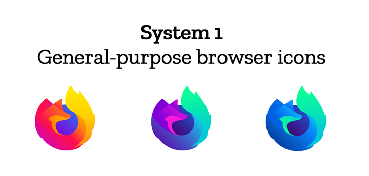
Mozilla has announced that it is redesigning the logos and icons of its Firefox brand, and it is asking the feedback of users to achieve that.
Table of Contents
The masterbrand icon will show up in Mozilla’s marketing, at events, in co-branding with partners, and in places like the Google Play store where their products can be found.

For Firefox Quantum’s icon along with rendered colors on the Firefox Developer Edition and Firefox Nightly.


Browsers with a singular focus such as Firefox Reality browser for VR applications and privacy-driven Firefox Focus mobile browser.


The icons for new applications and services signal the unique function of each product. Color and graphic treatment unite them and connect them to the master brand. Each icon shape is one of a kind, allowing people to distinguish among choices seen side by side on a screen.
![]()
![]()
All of the designs are still subject to change and are not final. Mozilla says that they’re still working on explorations of typography, graphic patterns, motion, naming, events, partnerships, and other elements of the system, and are still gathering feedback. For that, the company opened the comments section of their blog post so users can leave their suggestions, opinions, and feedback.
Source: Mozilla Blog

YugaTech.com is the largest and longest-running technology site in the Philippines. Originally established in October 2002, the site was transformed into a full-fledged technology platform in 2005.
How to transfer, withdraw money from PayPal to GCash
Prices of Starlink satellite in the Philippines
Install Google GBox to Huawei smartphones
Pag-IBIG MP2 online application
How to check PhilHealth contributions online
How to find your SIM card serial number
Globe, PLDT, Converge, Sky: Unli fiber internet plans compared
10 biggest games in the Google Play Store
LTO periodic medical exam for 10-year licenses
Netflix codes to unlock hidden TV shows, movies
Apple, Asus, Cherry Mobile, Huawei, LG, Nokia, Oppo, Samsung, Sony, Vivo, Xiaomi, Lenovo, Infinix Mobile, Pocophone, Honor, iPhone, OnePlus, Tecno, Realme, HTC, Gionee, Kata, IQ00, Redmi, Razer, CloudFone, Motorola, Panasonic, TCL, Wiko
Best Android smartphones between PHP 20,000 - 25,000
Smartphones under PHP 10,000 in the Philippines
Smartphones under PHP 12K Philippines
Best smartphones for kids under PHP 7,000
Smartphones under PHP 15,000 in the Philippines
Best Android smartphones between PHP 15,000 - 20,000
Smartphones under PHP 20,000 in the Philippines
Most affordable 5G phones in the Philippines under PHP 20K
5G smartphones in the Philippines under PHP 16K
Smartphone pricelist Philippines 2024
Smartphone pricelist Philippines 2023
Smartphone pricelist Philippines 2022
Smartphone pricelist Philippines 2021
Smartphone pricelist Philippines 2020
Amelia Ryan says:
Mozilla’s marketing, at events, in co-branding with partners, and in places like the Google Play store where their products can be found, this helps more in this.
Alyssa says:
I never knew Mozilla tried out so many logos before coming up with the final logo. With so many options available for the user to select, do you think about performing this logo feedback using off-site platforms like PickFu.com and Google Surveys would have yielded better results?