Apple’s former flagship, the iPhone 6, launched two years ago and it featured a drastic redesign that has been hated and loved at the same time. But we also can’t deny that it brought a big influence to the designs of other smartphones especially those running Android. Here’s a list of Android smartphones that will remind you of the iPhone 6 or 6s.

Announced in November 2014, two months after the iPhone 6, the Lenovo S90, aka Sisley, was unveiled. Its similarities to the iPhone 6 include the metal unibody with curved sides, antenna band at the bottom, holes for the speaker and microphone, and Gold, Silver/Platinum, and Grey color options.

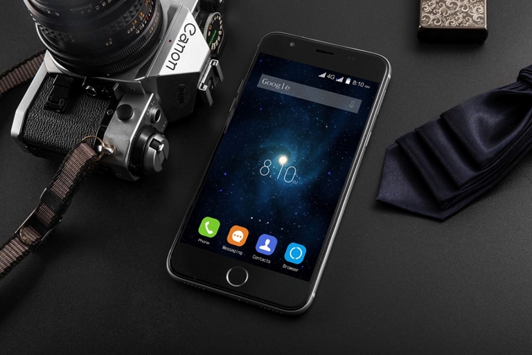
This Chinese company loved the design of the iPhone 6 so much that they decided to just copy the whole thing, even the UI and icons, and released the KitKat-based Blackview Ultra in November 2014. From the screen size of 4.7-inches, to the unibody design with antenna bands outlining its contours, camera and LED flash placement, to the lone home button placed below the display.

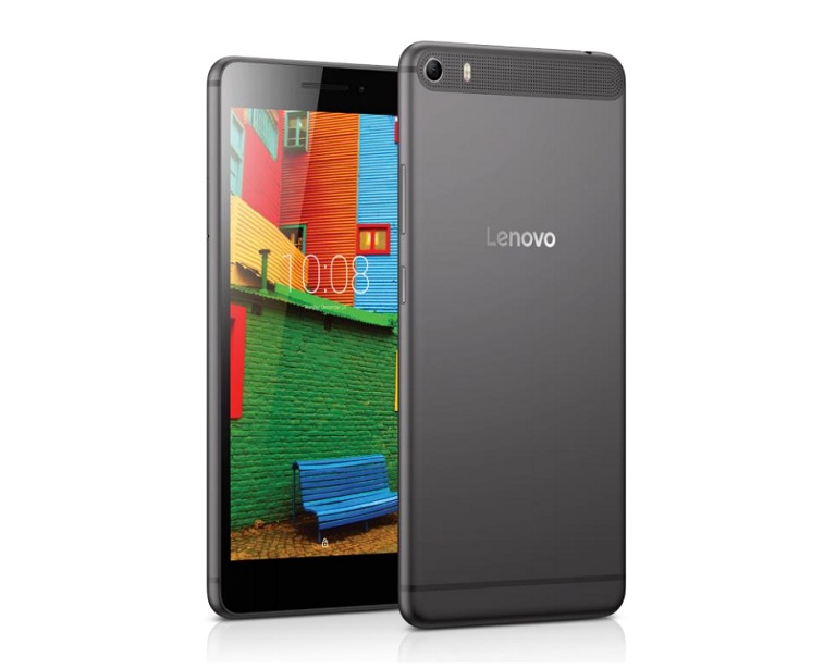
In September 2015, just after Apple announced the iPhone 6s, Lenovo decided to try the iPhone look-alike approach with the S90 and applied it to the 6.8-inch PHAB Plus. Gone are the speaker and mic holes at the bottom but it still has the curved sides and antenna bands. The slim design actually helped the PHAB Plus look attractive even for a large device.

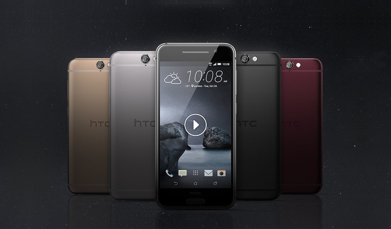
HTC is in it as well, and announced the HTC One A9 in September 2015. At 5-inches, its sits comfortably between Apple’s 4.7-inch iPhone 6s and the 5.5-inch iPhone 6s Plus, and features a metal body with curved sides and antenna bands. It also comes in grey, gold, and silver, with the addition of red and pink.

Samsung’s old flagship, the Galaxy S6, which was announced in March 2015, didn’t escape the criticism although it’s the least in the list to look like an iPhone 6. The culprit was the curved metal frame and the familiar placement of ports and speaker holes at the bottom. As for the rest, it looks very much different.

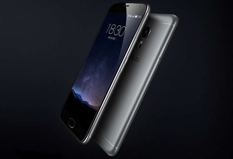
Meizu’s Pro 5 which was introduced in October 2015 has some similarities with the iPhone 6’s design – the metal unibody with curved sides, and antenna bands. Good thing Meizu opted to use a racetrack-shaped home button instead of circular, otherwise it will look very much like the iphone.

Blackview is back with a new one with the Ultra Plus which it introduced in January 2016. It’s basically the clone of the larger iPhone 6 Plus so we don’t need to say more.

OPPO’s latest offering is the F1 Plus, which was announced in January 2016 but made an official appearance just this month. It has a 5.5-inch display and features a metal unibody with curved sides and antenna bands lining the top and bottom part. Up front, it’s almost like the iPhone 6s Plus if it weren’t for the racetrack-shaped home button.

The M3 Note which was introduced just this month looks similar to the Pro 5 – same slim metal unibody with curved sides, and racetrack-shaped home button. The speaker and mic holes at the bottom look very familiar as well.

The Meizu Pro 6, which was announced right after the M3 Note, looks sleeker than the Pro 5 but still sports the, again, familiar look – metal unibody with curved sides. It did something different to the antenna bands though and gave it some arches. The bottom part, though, looks just like the iPhone 6.
And there you have it. These smartphones might have some design similarities with the iPhone 6 but can still be considered as some of the most attractive smartphones in the market. Except for Blackview since they blatantly copied Apple’s design.
Got something to add? Let us know in the comments below.

YugaTech.com is the largest and longest-running technology site in the Philippines. Originally established in October 2002, the site was transformed into a full-fledged technology platform in 2005.
How to transfer, withdraw money from PayPal to GCash
Prices of Starlink satellite in the Philippines
Install Google GBox to Huawei smartphones
Pag-IBIG MP2 online application
How to check PhilHealth contributions online
How to find your SIM card serial number
Globe, PLDT, Converge, Sky: Unli fiber internet plans compared
10 biggest games in the Google Play Store
LTO periodic medical exam for 10-year licenses
Netflix codes to unlock hidden TV shows, movies
Apple, Asus, Cherry Mobile, Huawei, LG, Nokia, Oppo, Samsung, Sony, Vivo, Xiaomi, Lenovo, Infinix Mobile, Pocophone, Honor, iPhone, OnePlus, Tecno, Realme, HTC, Gionee, Kata, IQ00, Redmi, Razer, CloudFone, Motorola, Panasonic, TCL, Wiko
Best Android smartphones between PHP 20,000 - 25,000
Smartphones under PHP 10,000 in the Philippines
Smartphones under PHP 12K Philippines
Best smartphones for kids under PHP 7,000
Smartphones under PHP 15,000 in the Philippines
Best Android smartphones between PHP 15,000 - 20,000
Smartphones under PHP 20,000 in the Philippines
Most affordable 5G phones in the Philippines under PHP 20K
5G smartphones in the Philippines under PHP 16K
Smartphone pricelist Philippines 2024
Smartphone pricelist Philippines 2023
Smartphone pricelist Philippines 2022
Smartphone pricelist Philippines 2021
Smartphone pricelist Philippines 2020
Ren says:
HTC One A9? But as far as I know, HTC brought the design concept earlier than iPhone 6/6s.
Phil says:
Add in our own local copies: Cherry Mobile Flare 4 and that Firefly Mobile Intense—something. I forgot what it was called, but it employed a circular Home Button that supposedly doubled as a Fingerprint Scanner, but also had On-Screen Buttons, which felt super redundant to me.
the other says:
Only Sony and Blackberry stand out. Just add the others that I didnt mention.
Fantard says:
HTC used the design way back with the M7.. do your research naman before posting.
Easy E says:
Doesn’t matter who had the design first. “That remind you of” lang naman. Kayo naman guys…
defyhf says:
Serious? Kulang nalang, ilalagay pa nila dun yung tiles sa banyo kasi square sya. Seriously, this is like shitposting level tech journalism.
Kand says:
The Samsung Galaxy J3 (6) is like iPhone 6s pnly better
Thor says:
They can use the design aesthetic so long as they are pay the licensing for it. Its a trend not just in tech but in all business industries.