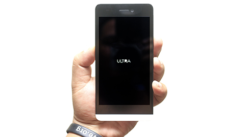
While we’re prepping for our full review of the Cherry Mobile Ultra, we thought of giving you guys a brief overview of its basic feature set first, as well as a quick tour of its hardware to see what this LTE-enabled handset has to offer in terms of its design and build.
When we’re looking at the CM Ultra head on, we can’t help but notice a faint resemblance between the handset’s design and that of the Blackberry Z10. At first we thought that the similarity was only skin deep, but as soon as we picked the handset up, it also felt very similar to the hands as Blackberry’s first full-touchscreen handset.

One of the few differences between the two devices, design-wise, is the placement of the buttons and external components. The power button of the CM Ultra is located at the right side, while the Micro-USB port is placed at the bottom, and is slightly off-center.
Meanwhile, the volume rocker occupies the left flank of the CM Ultra and the audio port is situated at the portion of the device, below its white-colored chin that gave it a slight similarity with the Z10’s façade.

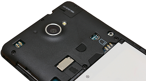
The CM Ultra’s 13MP snapper is smacked in the top-center portion of its posterior, and is accompanied by a tiny LED flash. On the other end of the pole is where speaker grilles are located with a “Cherry Mobile” logo right above it.
Underneath the removable back lies the Ultra’s 2000mAh battery pack which is neighbored by a pair of slots for a Micro-SIM card and a Micro-SD card.

All in all, we think that the Cherry Mobile Ultra is one of the more decent looking handsets that the local company has rebranded in recent times. We really like the smartphone’s minimalist design and it feels very nice to the touch despite being a little hefty.
But not only does the Ultra look good, it also gives a sense of durability thanks to the material used in crafting its body. It’s not the thinnest, nor the most bad-ass looking smartphone out there, but we think that it has enough allure to woo some of the nitpicky consumer.
Cherry Mobile Ultra specs:
5-inch HD IPS display, 1280×720 @293ppi
1.2GHz Snapdragon 400 MSM8926 quad-core processor
Adreno 305 GPU
1GB RAM
Expandable 8GB internal memory
13MP BSI rear camera with LED flash
1080p video recording @30fps
2MP front-facing camera
LTE, HSPA
WiFi 802.11 b/g/n, DLNA, Wi-Fi Hotspot
Bluetooth 4.0 LE
FM Radio
GPS w/ A-GPS, GLONASS
Single SIM (Micro)
Android 4.3 Jellybean
2,000mAh battery
Dimension: 145.5 x 72.5 x 9 .0mm
Weight: 162g
Price: Php8,999USD 153INR 13,000EUR 146CNY 1,117

YugaTech.com is the largest and longest-running technology site in the Philippines. Originally established in October 2002, the site was transformed into a full-fledged technology platform in 2005.
How to transfer, withdraw money from PayPal to GCash
Prices of Starlink satellite in the Philippines
Install Google GBox to Huawei smartphones
Pag-IBIG MP2 online application
How to check PhilHealth contributions online
How to find your SIM card serial number
Globe, PLDT, Converge, Sky: Unli fiber internet plans compared
10 biggest games in the Google Play Store
LTO periodic medical exam for 10-year licenses
Netflix codes to unlock hidden TV shows, movies
Apple, Asus, Cherry Mobile, Huawei, LG, Nokia, Oppo, Samsung, Sony, Vivo, Xiaomi, Lenovo, Infinix Mobile, Pocophone, Honor, iPhone, OnePlus, Tecno, Realme, HTC, Gionee, Kata, IQ00, Redmi, Razer, CloudFone, Motorola, Panasonic, TCL, Wiko
Best Android smartphones between PHP 20,000 - 25,000
Smartphones under PHP 10,000 in the Philippines
Smartphones under PHP 12K Philippines
Best smartphones for kids under PHP 7,000
Smartphones under PHP 15,000 in the Philippines
Best Android smartphones between PHP 15,000 - 20,000
Smartphones under PHP 20,000 in the Philippines
Most affordable 5G phones in the Philippines under PHP 20K
5G smartphones in the Philippines under PHP 16K
Smartphone pricelist Philippines 2024
Smartphone pricelist Philippines 2023
Smartphone pricelist Philippines 2022
Smartphone pricelist Philippines 2021
Smartphone pricelist Philippines 2020
Gadgeteer says:
Ano ba klase review yan, puro external feel, walang antutu score!!!!
Name: JC says:
Have you read the title of this article? It says “first impressions”.
capon says:
gadgeteer, go buy some ice, i think it will soothe that burn… hahaha
jayrwafu says:
excited much? haha
Gadgeteer says:
Should not be “First Impressions”, but “first look impressions” – that should be the correct title
JC says:
go write your own article Gadgeteer!
nikko says:
For a 5inch HD screen with quadcore cpu, it should have at least 3000mah battery.. and i think using LTE network consumes more battery
cranium says:
How adorable. You’ve just stated the obvious. Congratulations dear.
nikko says:
thanks cranium. actually, my middle name’s Adorable. :)
btw, nice avatar, bagay.
theWatcher says:
How about the flare S2 sir? Can ypu do a review. You skipped the phone. I wish YT will fully review it coz i like how detailed your presentations are. Please, though i got the phone just now, I wanna know how the camera really advanced other branded phones. Tenchu
Easy e says:
Yung THL WS8 ay ganito din an price dahil na baba sila. 5in, 1.5ghz quad core, 2gb ram, 32gb rom plus external memory. Just saying dahil mas may good deal vs this cm phone.
a says:
walang lte
Qualcomm baby says:
Qualcomm are much better than Mediatek, 2000mah can last a day or longer, mas power saver ang Qualcomm processors than MTK at mas mabilis pa..GoodJob CM for changing your processors’ brand. kitkat update soon for ultra :))
JC says:
go
drew says:
It’s actually more like of Z30.
Zobel says:
Sureball na pagbili ko nito. Unless may lumabas na ibang may LTE. Sana man lang ginawa nang dual sim. At microsim pa pala to ugh! Kainis.
vince says:
saan ba mabibili to this week? wala pa sa mga pinagtanungan kong cherry mobile store eh.