Over the weekend, we received a handful of units for review and one of them is the fairly new handset from O+ called the Fab Elite. While we’re working on its full review, we decided to share our initial impression of this 6.5-inch whopper.
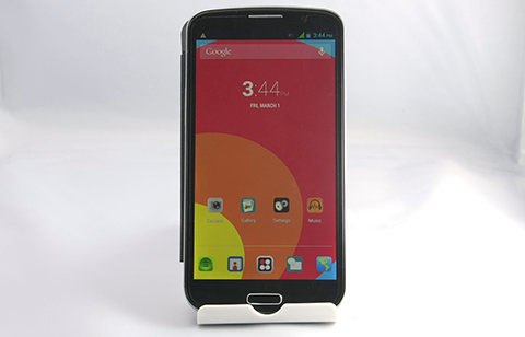
The O+ Fab Elite made its debut back in the latter portion of November and was launched alongside the Fab Turbo which also happens to be a gargantuan of a phone.
The moment we took the big-ass smartphone out of its box, the first thing that we noticed was how similar the Fab Elite’s design is to the Samsung Galaxy Mega 6.3.
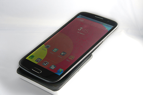
It’s got that same uncluttered front panel which is predominantly occupied by its 6.5-inch FHD display.
There’s also a physical home button at the bottom which sits in between the two keys for Menu and Back. The distinction between GT-I9200 and the Fab Elite is the “Samsung” branding at the top, but other than that, the latter is nearly identical to Sammy’s phablet.
The Fab Elite’s right flank houses the power button, while the volume rocker sits at the left side. There’s also a pair of buttons located at opposite directions; audio jack at the top and the micro-USB at the bottom.
Despite of the handset’s huge frame, we noticed that the buttons are easily accessible without having to adjust our hand too much. The buttons are somewhat flushed but not to the point that it becomes hard to press.
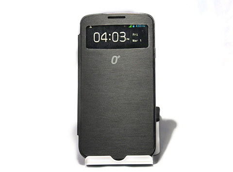
By default, the O+ Fab Elite comes with a fancy Smart Cover that covers the majority of the handset’s facade. A small portion of the cover has a small window that allows users to see the clock and notifications. It also displays incoming calls and users can either reject or receive the call without having to open the cover.
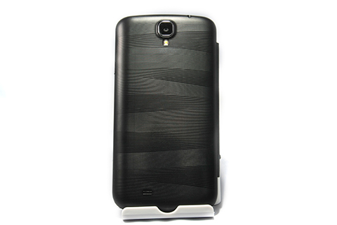
The Fab Elite’s cover is attached to its removable back casing. The texture of the ridged case reminds us of the exterior of the MiLi Power Sunny which not only wards smudges, but also makes the humongous handset easier to hold.
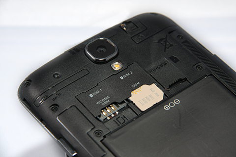
Removing the back case proved to be quite a chore. But once removed, you’ll be greeted with the usual components which comprises of a trio of slots for two full-sized SIM cards and Micro-SD card, as well as the Fab Elite’s considerably large battery pack.
Rounding up the list of Fab Elite’s components are the 13MP rear camera and speaker which are both located at the phones posterior.
O+ Fab Elite specs:
6.5-inch fHD AMOLED display @ 1920×1080 pixels, 339ppi
1.5GHz MTK6589 quad-core processor
PowerVR SGX 544MP GPU
1GB RAM
16GB internal storage
3G/HSDPA
Dual-SIM, Dual-Standby
WiFi 802.11 b/g/n
Bluetooth 4.0
FM Radio Tuner
GPS
13MP AF rear camera, LED flash
1080p video recording @ 30fps
5MP front-facing camera
Li-Ion 3000mAh battery
Android 4.2.2 Jellybean
Based on our brief encounter with the O+ Fab Elite, the handset is proving to be one helluva a handset, both in size and its build. The addition of the Smart Cover, coupled with its ridged back panel is definitely a plus for us because it gave a somewhat sophisticated feel to what is otherwise a stereotypical Android smartphone.
Of course, design alone isn’t going to be enough to sway consumers to dish out Php18,995 for this handset. In our full review, which should be up in a week or two, we’ll take a look at the other aspects of the O+ Fab Elite and see whether or not it’s worth the eyebrow-raising retail price.







wat da eF! no way!
i wonder why this brand is selling so expensive fones? not impressive though
it’s a feeling USA brand that copies Samsung, WOW such USA, such fake USA brand
Not worth the price. does not even have the octacore. Lots of other phones out there with better specs and lower prices.
Hindi ako techie pero para sakin hindi worth yun specs sa price. Halos kpresyo niya na yun 2nd hand na note 2.
Ang bibili nito, “Epic Mistake”
19k and no LTE, and a mediatek processor
sana maintindihan nyo na kya mahal yan dahil sponsor yan ng show ni Bossing na Eat Bulaga.
It’s not enough of a reason to justify its ridiculously high asking price.
seriously O+? go home, you’re drunk!
bobo bibili nito.pramis.
magsasayang lang kayo ng pera kung bibili kayo nito. konting dagdag nalang eh high-end na ang mabibili nyo.
Just tried a demo unit at Robinsons Ermita. It looks gorgeous. But the lag on the home screen is very noticeable especially when live wallpaper is on. The saddest part is when I asked the sales lady about the specs like GPU and why it lags (as compared to the galaxy mega displayed next to it), she just kept on insisting “naka-jellybean 4.2.2 na po yan. ganyan po talaga yung wallpaper gumagalaw kasi android yan eh.” :-(
tama… nakakairita yung mga ganyang salesperson. walang kaalam-alam sa binebenta nilang product. pano kaya sila makakabenta nyan? basta makabenta lang ang iniisip at hindi ang customer satisfaction. :D
mostly naman talaga eh hindi ganun katechie ang mga salesperson,dati may naabutan ako na bagong hire lng ata ang itinuro lng sa kanya eh ung basic specs ng gadgets na nakalagay naman sa ilalim ng bawat gadget…as usual pag nagtanong ka wala silang masasagot.
Are they smoking crack? No ones gonna buy this
Php 18,995 for a smartphone that’s a rip-off of Samsung Galaxy Mega 6.3? Fuck, no!
Good luck selling at least one unit of this silly rip-off, O+.
Ano ‘to advertisement?