Out with the old, in with the new. That is what Globe Telecom is doing now as they usher in a new and modern look for their website and company logo.

The first thing you’ll notice when you visit the new Globe webpage is the use of a richer shade of blue, which is also evident with their new glossy logo, and a set of clean looking finger-friendly icons. The slider page is still there but is now slightly larger and placed at the center.

Hover your mouse on the icons placed above the website and it will show another row of colorful icons which is reminiscent of MeeGo. Scroll down and you’ll see a palette of colors which will certainly feel at home on a Windows Phone 8 device.

As you’ve noticed, Globe’s new website took inspiration from mobile UIs. Well that’s because it’s now optimized to play well on your smartphone’s mobile web browser which in turn reduces the need to inconveniently zoom in and out.


Globe Telecom’s new website is still in beta as indicated on their URL “beta.globe.com.ph”. The old Globe site is still functional but I’m certain I won’t be missing it.


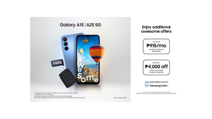
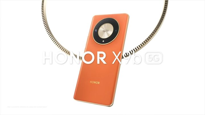
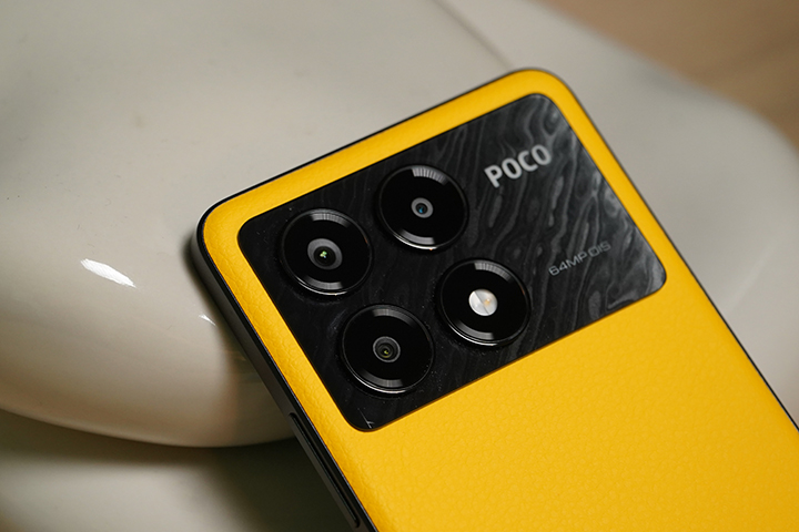



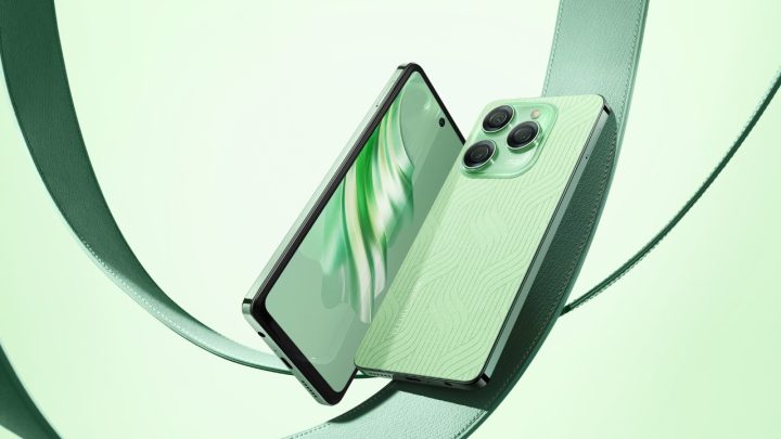



Announced na sa beta site ng globe yung plan for Note 3:
http://beta.globe.com.ph/galaxy-note3
Ganda nga ng website, sana man lang baguhin din nila ang after sales nila. Saka lang naman sila tumatawag pag malapit na expiration ng plan contract mo. hehehe
*snicker* yeah nice new site. Sana lang kahit 3G signal kaya nila mamaintain 24 hours in a day. *snicker*
They’re just catching up with todays trend. minimalist
Tinatadtad nanaman ang Globe ng “Ayusin nila ang service nila” comments…
Pag pangit ang service sa kabiang network, walang magrereact.
Anyway, very satisfied ako sa Globe. (don’t hate me kung kinomplement ko sila kasi lalabas nanaman pagka-closeminded ng Pinoy).
looks good though…
O, maganda ang Globe website ngayon ah. Keep it up nalang.
BULOK NA SERVICE concealed by this website!!!!!
Globe gising!!!!! Mga bwiset!!!!
cool! tried it in my mobile browser! sosyal sya. mobile optimized and responsive!
i also like how easy it is now to login to my globe account. love it!
new building, new logo, new website, ikaw na GLOBE!
Finally! Something fresh! Good job on this globe!
Sounds like the new website is messed up. Ang daming nakalutang ng mga codes na di naman for the site. Naka template ata to tapos di naayos pag lagay.
Kaya nga BETA site e. BETA pa po sya.
windows 8 + iOS7 hahahahaha. badtrip.
Can’t complain… This is better than Yahoo logo, who tried 30 awesome logos each day for 30 days, then ended up with the worst one.
kamukang kamuka ng windows 8
So Globe tama bang sisihin ang homeowners namin. Patawa talaga lahat ng alibi nagawa niyo na. Ayusin niyo muna network niyo.
Our sincere apologies for the inconvenience. We have offered several times to put up a cell site in your village through the homeowners’ association. Unfortunately, our offer has been repeatedly turned down. We continue, however, to explore other ways to improve the signal quality in your area for the benefit of Globe subscribers residing in the village. We are taking note of the calls that we have received regarding our service quality so we can share this information with the HOA. You may also want to take this up directly with the HOA members to help us expedite the installation of a cell site and greatly improve our service in the village. Thank you very much.
E kung di ka ba naman isa’t kalahating tanga, gusto na nga nilang umaksyon, yung HO nyo ayaw, anong magagawa? Parang pasyente lang yan na ayaw uminom ng gamot na makakapagpagaling sa kanya eh. Isip isip din bago ngumawa.
pero marami namang paraan para makapagtayo ng cellsite nang di nagamit ng lupa ng isang village…dito saamin may nakapagtayu ng cell site sa labas ng village(i think smart un kase wala paring 3G samin)…puro alibi lang yan
globe pls ayusin nyu service nyu…bago ako magpasya na bumili na lng ng dual sim na phone para makagamit ng smart…dito sa southcrest vill sa dasma cavite walang 3G signal samantalang smart eh meron.nasa syudad naman kami bat wala kming ganung signal
Susmaryosep! Carbon copy ng my.smart.com.ph. Nice going, Globe. Runner-up as usual!
Hndi po siya carbon copy ng smart,
Resize nyo ung browser nyo by width or view nyo s mga mobile devices, maki2ta nyo ung difference nya s smart website. Responsive design sya, latest trend po s web ngaun.
Kudos to globe for the new design!
Ayusin nila service nila. Yun ang kanilang pagkaabalahan!
Yung bulok na services kailan kaya babaguhin?!
Kasalanan ng signal boosters kaya daw hindi maganda ang service nila lmfao
imba sa commercial pero sa services bagsak.