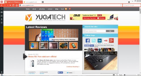
If you’re starting to hate IE, Firefox, or even Chrome, there’s Vivaldi — a promising new browser that packs a sleek design and a lot of features.

This browser has a lot of cool stuff under its nifty UI: You can build separate tabs for your speed dials, separating your work and personal links. Quick shortcuts can be assigned to any given set of key combinations, and you can stack your active website tabs. It built a very extensive community at its backbone, offering interaction among the browser’s users. Also, it’s built using the Chromium project given the small number of devs working on its startup, and it has side panes for mail (coming soon), contacts, bookmarks, and notes.

If the UI and a few of its features remind you of earlier versions of the Opera web browser, that’s because its ex-CEO is the man behind the new product, which he says is a new venture following their departure from it. The direction of Opera in the recent times as it changed its platform to Webkit from Presto engine and shut down its large community made them decide to create a new browser that puts the user first. “Sadly, it [Opera] is no longer serving its community of users and contributors who helped build the browser in the first place,” he says.
If you’re want to try this one out, a widely available technical developer preview is available at their website.


Paano ba to i-fix tong Adobe Flash is Outdated dito sa Vivaldi?
Used to be a loyal user of Opera. Bwiset at naging Chrome under the skin ang Opera 22+. I still use Opera 12 but it can’t render some of the more popular sites such as FB anymore.
Wow.. Good find there.. Hopefully they’ll be developing on android/ios systems as well..